New Year, New Look. Deployed Resources Embarks on a Company-Wide Rebrand
As innovators and industry leaders in providing sustainable solutions for building safe and temporary communities, it is important for us to apply the same effort to innovate in each and every action we take.
Therefore, beginning in the summer of 2018, we embarked on a mission to complete a company-wide rebrand. For many, a rebrand sometimes only includes a visual update, but for us, it was so much more. It was important that we stepped back and revisited the core question, “Who are we and what do we stand for?”
So, what did we learn? We learned that…
We achieve the impossible by challenging the extraordinary.
We do this through…
Our Mission
Deployed Resources is dedicated to safely and efficiently providing transparent facility support and logistical services, anywhere, anytime. Rooted in reliability and readiness, we are the first-choice provider for government, commercial, and disaster contracts.
This is only accomplished by staying true to…
Who We Are
Deployed Resources is a vibrant, dedicated team comprised of innovators from the defense, construction, engineering, and entertainment industries. Our unique blend of talent, expertise, and knowledge allows us to best serve our clients’ needs by delivering superior services and dependable equipment necessary for every type of mission.
We achieve what others consider impossible and specialize in handling the unconventional and unpredictable.
While it was important to get down to the core of who we are, it didn’t hurt to enhance the visual aesthetic of our brand to make it just as vital and cutting-edge as we are.
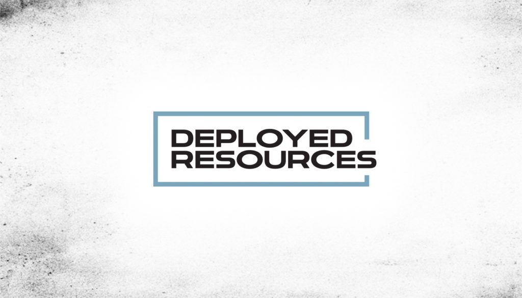
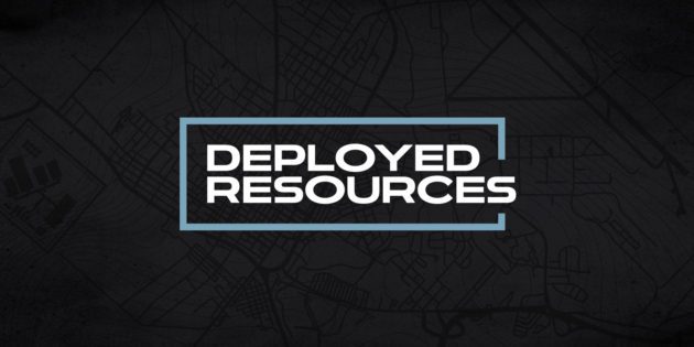
Our first action-step was to update the logo; however, as an established and recognized brand, we didn’t want to stray too far from our original design. While the design update may appear simple, our concept behind it is more complex.
The modular-shaped line outlining Deployed Resources demonstrates the variety of containerized equipment we offer. However, the Deployed Resources name breaks that same modular-shaped line which frames it. This demonstrates our innovativeness and determination to always think outside of the box to achieve the impossible for our customers.
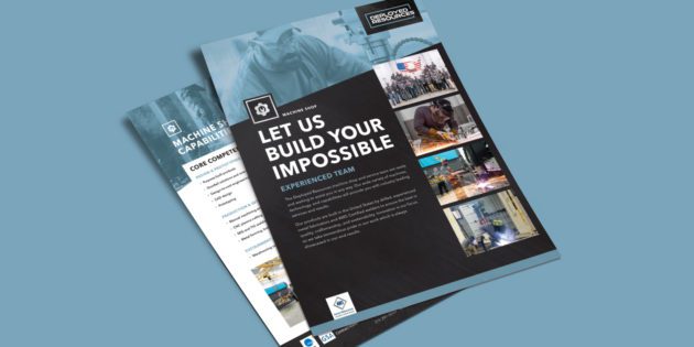
In addition to a new logo design, we also created a new set of colors to match our energy, industry and service icons to better showcase who and how we serve, and also a variety of unique custom, graphic elements to enhance all branded materials created including typographical maps, grids, and metal and grit textures.
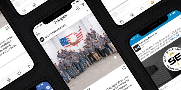
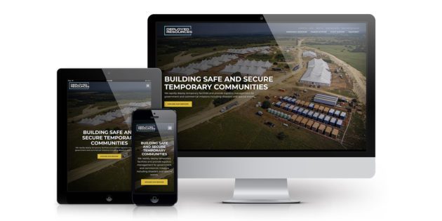
But instead of telling you all about it, check out our new brand by following us on LinkedIn, YouTube or by exploring more of our new website!
